New Web Design (Revolutionary Deathmatch)
#1

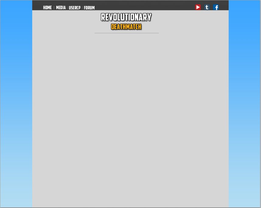
I am currently in the process of developing Revolutionary Deathmatch, a project which is nothing less than what the title suggests: revolutionary. One key part of this project is online integration of the server, which is where the design I'm about to show you comes into play.

The theme I'm aiming for is simplicity and user-friendliness. I would like to create the most fluid experience possible for users, which is a concept that is often neglected in websites made for SA-MP servers. Please let me know your general first impressions of this rough draft. Keep in mind, if you happen to see any errors in spacing or alignment, those will be fixed when the final draft is created. Try to ignore these.

Reply
#2

I understand the purpose, but I also think it's too basic. I'm one for simplistic things too, but this is taking it too far. You need some more colors- right now the grey/white/black theme is quite a turnoff. Furthermore, I feel like the "line" separations you have going is quite... boring.

I'd go register at a GFX forum somewhere and see if there aren't some designs shared that are trying to achieve the same goal!
Reply
#3

Quote:
Originally Posted by RealCop228
Посмотреть сообщение
I understand the purpose, but I also think it's too basic. I'm one for simplistic things too, but this is taking it too far. You need some more colors- right now the grey/white/black theme is quite a turnoff. Furthermore, I feel like the "line" separations you have going is quite... boring.

I'd go register at a GFX forum somewhere and see if there aren't some designs shared that are trying to achieve the same goal!
I'm personally very fond of the gray scale color scheme, but I suppose that is just personal taste. If you don't like the color scheme, however, I don't believe that constitutes the website as being "too basic." One can easily change the colors of the website - and while I do appreciate your input, I'm focusing more on the actual building blocks of the site (such as your mentioning of the bars). I appreciate the criticism nonetheless.
Reply
#4

Quote:
Originally Posted by RealCop228
Посмотреть сообщение
I understand the purpose, but I also think it's too basic. I'm one for simplistic things too, but this is taking it too far. You need some more colors- right now the grey/white/black theme is quite a turnoff. Furthermore, I feel like the "line" separations you have going is quite... boring.

I'd go register at a GFX forum somewhere and see if there aren't some designs shared that are trying to achieve the same goal!
Yep, he's right - But nothing too much, I think like a cool background and taking some darkness away would make it amazing c:

But, really - It's upto you on how you do it, since you're the owner of the Community.
Reply
#5

way simple.
Reply
#6

Quote:
Originally Posted by 54WillEatU
Посмотреть сообщение
way simple.
?? ._. good
Reply
#7

I like the simplicity, but I would like it if you allowed some spaces at the corners, and where you end the text, the line and the immiediate end of the box, know what I mean? Make the CSS a bit more sleek, get it?
Reply
#8

If you're aiming for simplicity and something revolutionary I would suggest going with something so basic and dull. You need more colors than just gray, excluding the icons. If you're looking for someone also that's 'fluid' for everyone yet makes your life easy, I would make the width just a narrow container with centering margins. A width of 960 should be fine for a container.

You should also look into creating a metro themed page, it may go towards your "revolutionary" and simplistic idea.
Reply
#9

Quote:
Originally Posted by Dark Killer
Посмотреть сообщение
?? ._. good
?? What?? ._.
Reply
#10

I appreciate all of the feedback! Due to popular demand, I've decided to trash the old design I was working on and start a new one from scratch. I've made it a point to include more colors.

What are your thoughts so far?

Reply


Forum Jump:


Users browsing this thread: 1 Guest(s)