07.05.2013, 02:52
(
Последний раз редактировалось RevolutionaryGaming; 07.05.2013 в 17:04.
)
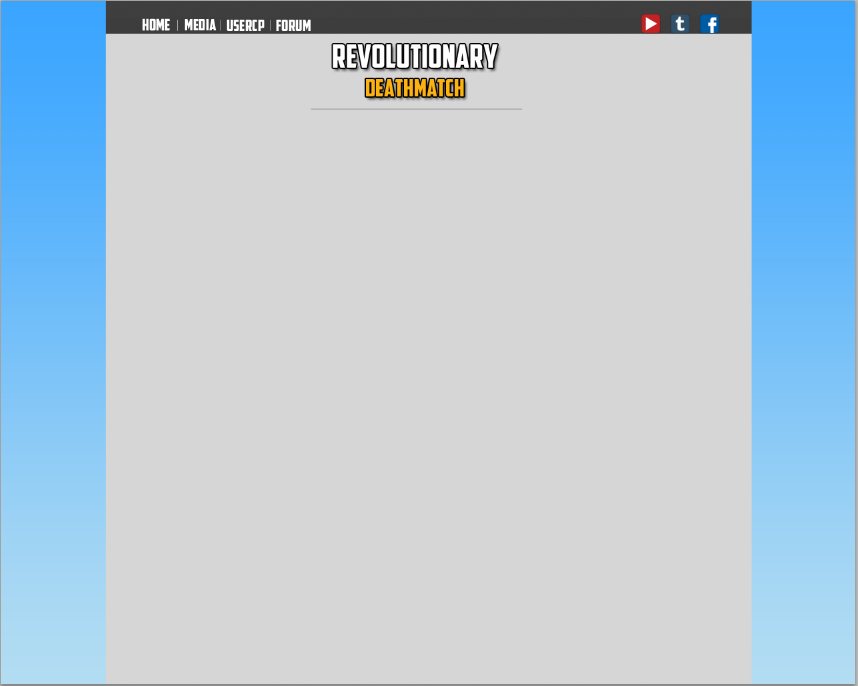
I am currently in the process of developing Revolutionary Deathmatch, a project which is nothing less than what the title suggests: revolutionary. One key part of this project is online integration of the server, which is where the design I'm about to show you comes into play.
The theme I'm aiming for is simplicity and user-friendliness. I would like to create the most fluid experience possible for users, which is a concept that is often neglected in websites made for SA-MP servers. Please let me know your general first impressions of this rough draft. Keep in mind, if you happen to see any errors in spacing or alignment, those will be fixed when the final draft is created. Try to ignore these.

The theme I'm aiming for is simplicity and user-friendliness. I would like to create the most fluid experience possible for users, which is a concept that is often neglected in websites made for SA-MP servers. Please let me know your general first impressions of this rough draft. Keep in mind, if you happen to see any errors in spacing or alignment, those will be fixed when the final draft is created. Try to ignore these.


