Posts: 40
Threads: 4
Joined: Nov 2009
Reputation:
0
I've had the Release Preview running on my laptop for a few months now and there's some things I like, and some I dislike. An upgrade from XP, Vista, or 7 to Windows 8 Pro will be offered for $39.99, so I'd assume many will upgrade...
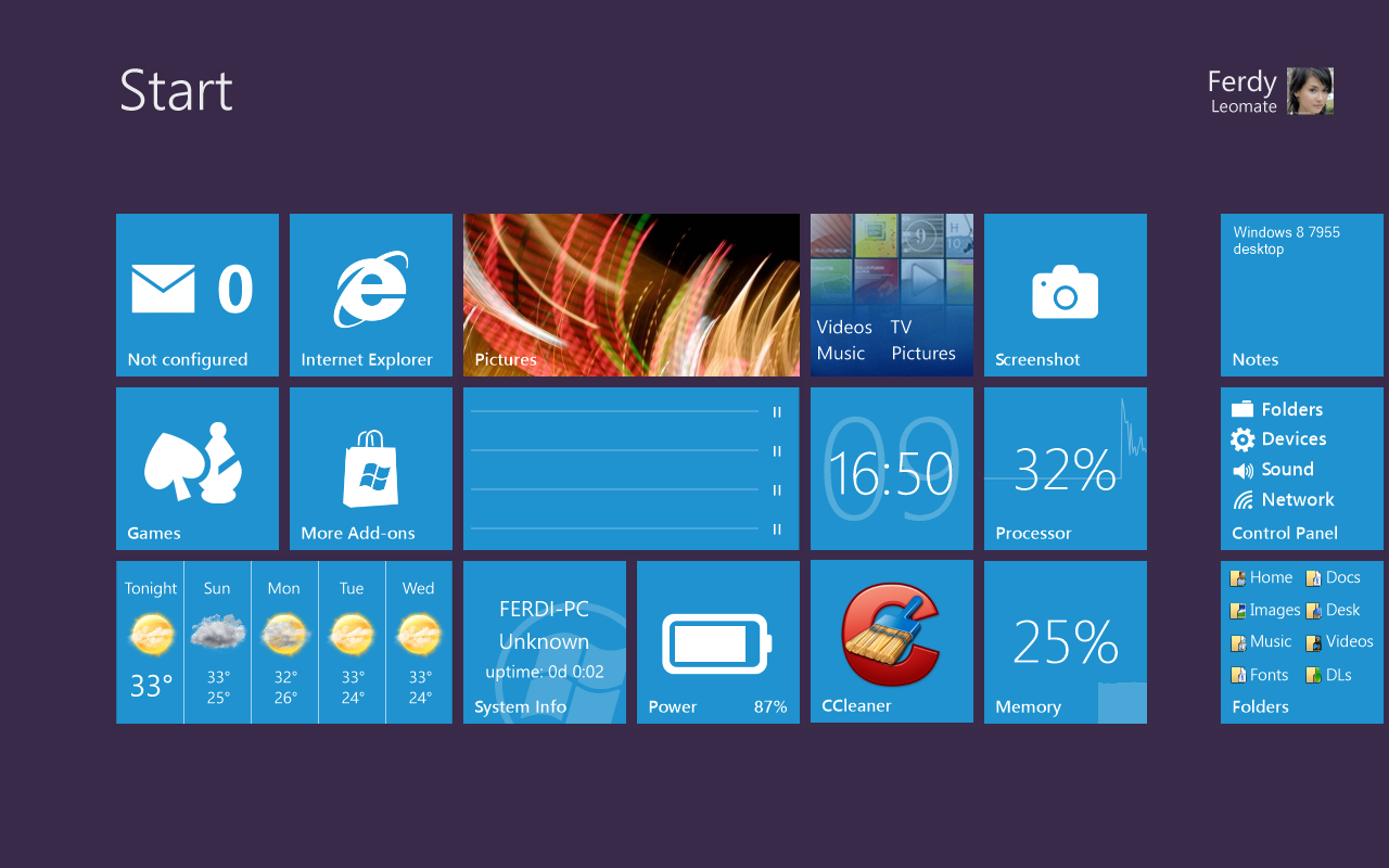
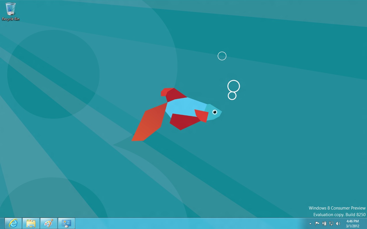
By The Way, that "boot Screen" as you called it is actually the start menu. When you turn your PC on, that menu will appear. In that menu, there is a desktop block, which you can click to view your desktop. To return to your start menu, you can simply push the windows button on your keyboard, or scroll to the far left bottom corner, and the menu will appear.
Thanks,
Gerrit
Also, between the two, I have seen a noticeable boot and shutdown difference with Windows 8.
Posts: 548
Threads: 25
Joined: Mar 2011
Reputation:
0
No start button?
I wouldn't get it.
Posts: 10,066
Threads: 38
Joined: Sep 2007
Reputation:
0
No start button. Probably the worst mistake they ever made. And to continue the tradition of one good Windows OS being followed by a bad one; Windows 98 good, Windows ME bad, Windows XP good, Windows Vista bad, Windows 7 good, Windows 8 bad? So ye, i'll probably stick with 7 until they release Windows 9.
Posts: 40
Threads: 4
Joined: Nov 2009
Reputation:
0
It reminds me of the Windows Phone OS. Although yes, they have changed the UI alot.
Posts: 1,781
Threads: 13
Joined: Sep 2009
Reputation:
0
lol i first thought this is a textdraw concept. it looks like one...
after decades, i got used to low-quality GUIs, M$ cannot disappoint me anymore - they suck as designers.
now seriously: a bootscreen with 99% redundant information? procesor 32%, memory 25%? used? free? how much? 10MHz & 16MB? even the Canon cameras' menus are looking more decent.. oh, no start button, huh? but a taskbar eating 10 centimeters in height to fit in a few fancy icons? jesus christ.


