Posts: 3,004
Threads: 12
Joined: May 2011
nice,loved the first 2 and the last signature
Posts: 1,208
Threads: 52
Joined: Jan 2012
Reputation:
0
I like the second last one
Posts: 10,066
Threads: 38
Joined: Sep 2007
Reputation:
0
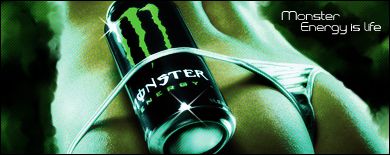
iPhone, Beats and Nike are practically all the same. Smudge, smudge, smudge, paste render, smudge some more, apply color filter, done. Still, I wouldn't be able to do it any better.
Try experimenting with the smudge settings a bit more, they're a bit repeatitive.
You should look up some tutorials on depth and flow, try to blend your focal with the background. Maybe try adding a lightsource to your signatures, burn & dodge tools will help a lot with depth, and sharpen ofcourse.
I like that you're using basic fonts but you ought to work a bit on the text placement. Always try to place your text near the focal not in corners (looks bad)
By the way, don't be shy to try gradient maps, photo filters and just experiment with all kinds of colors.
