Some feedback on my web design please - Printable Version
+- SA-MP Forums Archive (https://sampforum.blast.hk)
+-- Forum: Other (https://sampforum.blast.hk/forumdisplay.php?fid=7)
+--- Forum: Everything and Nothing (https://sampforum.blast.hk/forumdisplay.php?fid=23)
+--- Thread: Some feedback on my web design please (/showthread.php?tid=435770)
+- SA-MP Forums Archive (https://sampforum.blast.hk)
+-- Forum: Other (https://sampforum.blast.hk/forumdisplay.php?fid=7)
+--- Forum: Everything and Nothing (https://sampforum.blast.hk/forumdisplay.php?fid=23)
+--- Thread: Some feedback on my web design please (/showthread.php?tid=435770)
Some feedback on my web design[UPDATED WITH V2] - Rillo - 08.05.2013
Well I've been working on this for a while now and just figured I'd post it here to get some feedback and see how much further I can go with it. I'm creating this design for a server I've been working on which is obviously called Project Mayhem.
Please bare in mind this is just the design and no coding has been done (yet).
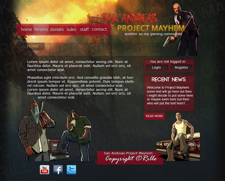
Created in Photoshop

Any constructive feedback would be much appreciated, thanks.
Forgot to add, the server will not be roleplaye so keep that in mind giving the feedback. Does this look good enough for a TDM/WAR based server?
_____________________
This is the outcome after acting on some of the feedback.
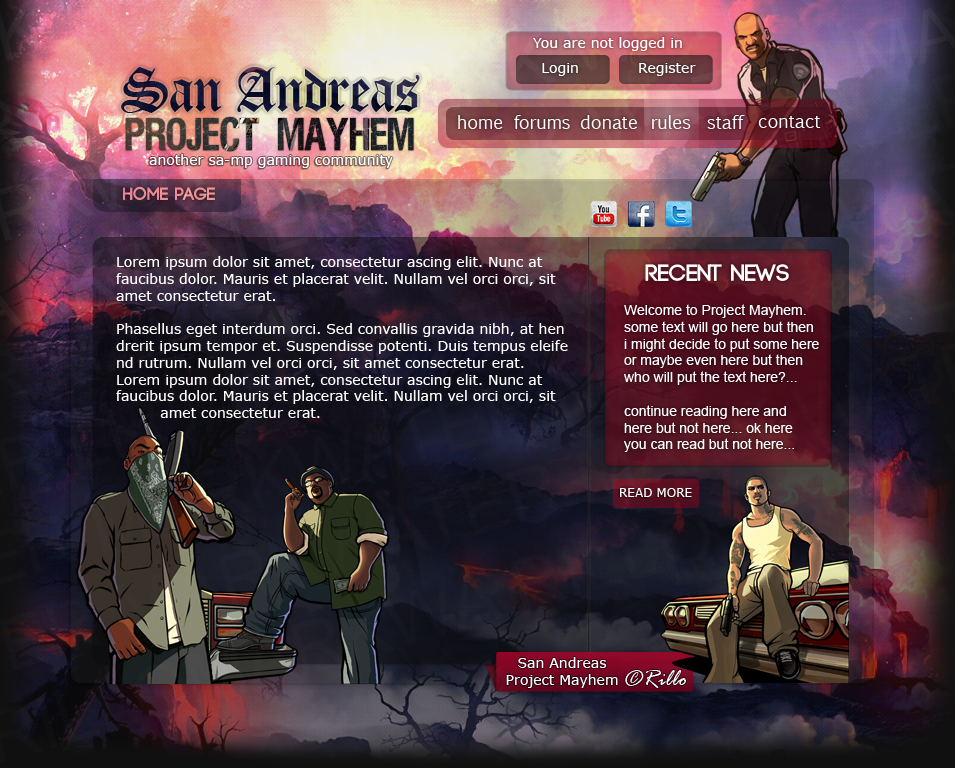
Does it look good enough for a war torn server? Picture the background as MT Chiliad after a few missile strikes and nukes

Re: Some feedback on my web design please - BlazingKnife - 08.05.2013
Good One Really Loved it

Re: Some feedback on my web design please - IceCube! - 08.05.2013
Well you asked for feedback so lets start with the things I DONT like or Cons.
Cons:
- The Red Menu bar fails to match the Recent news, it really should if you want this to look like its ment to be together.
- The 'Mayhem' colours end partway through, maybe place this as a central part of a background (Cant explain this and do not have a photo editor to edit your picture to show you)
- Social networks should be SAMLLER, and in a corner.. not massive and at the bottem...
- To my mind the 'Copyright' is way too big
- You've water marked the background and the more I look at it the more annoying that gets.
- YOu have a second Navigation Bar.
- Colours match well...
Re: Some feedback on my web design please - Scones - 08.05.2013
Quote:
|
Originally Posted by IceCube!
 Well you asked for feedback so lets start with the things I DONT like or Cons.
|
Re: Some feedback on my web design please - Rillo - 08.05.2013
Thanks BlazingKnife
Quote:
|
Originally Posted by IceCube!
Well you asked for feedback so lets start with the things I DONT like or Cons.
Cons:
|
About the watermark, yeah I know it's annoying but as this is just the base design anyone could easily take it and move a few things around then claim it as their own. (just like some people be doing with scripts...)
The navigation bar is suppose to look like that. If you mean where it says HOME under the navigation bar, that's suppose to be there too letting the user know what page he/she is on. It will obviously change for other pages.
Thanks for the feedback!
Re: Some feedback on my web design please - OpticKiller - 08.05.2013
its alright can do with better buttons on the top
Re: Some feedback on my web design please - GamerX54 - 08.05.2013
i don't like the "copyright" its too big else its good.
Re: Some feedback on my web design please - Scenario - 08.05.2013
It might just be my eyes since they're playing tricks on me today, but I don't think all of the reds are matching.. that's definitely something to think about doing. Obviously the menu bar is supposed to add a bit of white to whichever page you're currently on; the other parts are what I'm really referring to.
I don't like the social icons at the bottom; they look ugly to me.
Re: Some feedback on my web design please - Rillo - 08.05.2013
Quote:
|
Originally Posted by RealCop228
It might just be my eyes since they're playing tricks on me today, but I don't think all of the reds are matching.. that's definitely something to think about doing. Obviously the menu bar is supposed to add a bit of white to whichever page you're currently on; the other parts are what I'm really referring to.
I don't like the social icons at the bottom; they look ugly to me. |
Re: Some feedback on my web design please - Potassium - 09.05.2013
Not bad, nice work